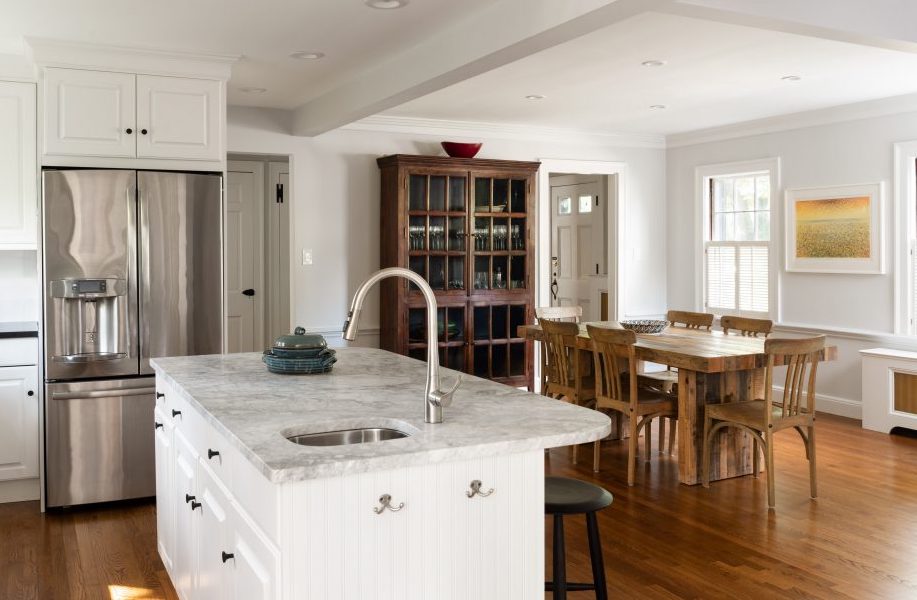
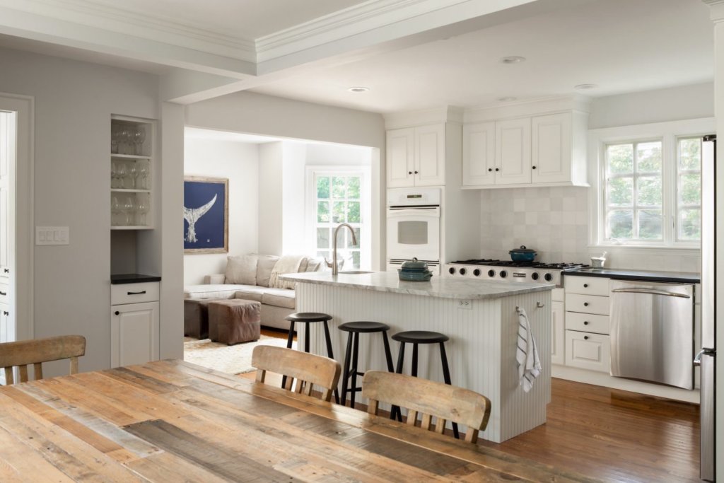
Today’s homeowners are typically looking for an open-concept floorplan. While the kitchen has always been the heart of the home, the primary chef in the family no longer wants to be relegated to a closed-off kitchen. Instead, they want to gather with family and friends and have more casual dining space rather than a formal dining room.
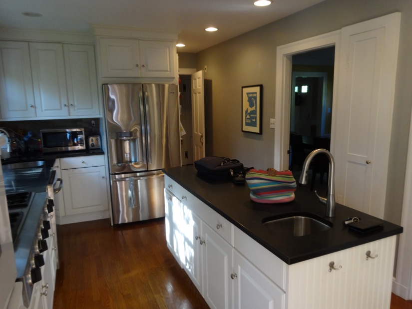
The original kitchen had been remodeled but was dark and closed off from the dining area. 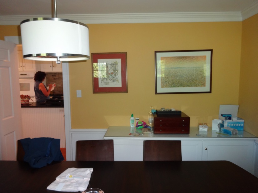
The formal dining room didn’t suit the lifestyle of this family of four. The yellow wall between the kitchen and dining room would be removed.
These Belmont homeowners chose a gorgeous home built in 1938 with the typical New England Colonial floorplan, featuring smaller rooms including a separate dining room. The kitchen had been remodeled in the not-too-distant past, but the homeowners requested a larger island to accommodate casual seating and more prep space.
The most dramatic part of this remodel is the removal of the wall between the kitchen and dining room. Once the wall was removed, the kitchen and dining area became one large, inviting, multi-purpose space which is much brighter now that light enters from both sides of the home.
Next, we tackled some of the other kitchen upgrades on their wish list. The island countertop was replaced with a breakfast bar overhang (made possible by the wall removal) made of leathered super white quartzite, a naturally occurring metamorphic rock. The enlarged island is perfect for meal prep, casual dining or for the kids to do their homework. The white quartzite is also the perfect contrast to the rest of the black stone countertops and adds to the brightness of the room.
Custom built-ins were next on the list. We made use of smaller, but extremely useful available space to the left of the family room entry to accommodate another cabinet and shelves for wine glass storage as seen in the photo above. But the real highlight is the coffee station which has doors that can be left open (and smoothly recess out of the way) or closed if preferred. This custom built-in features a wide cabinet below for storage and the perfect space for coffee makers and accessories on the counter and shelves above. Electrical outlets are conveniently located behind the appliances.
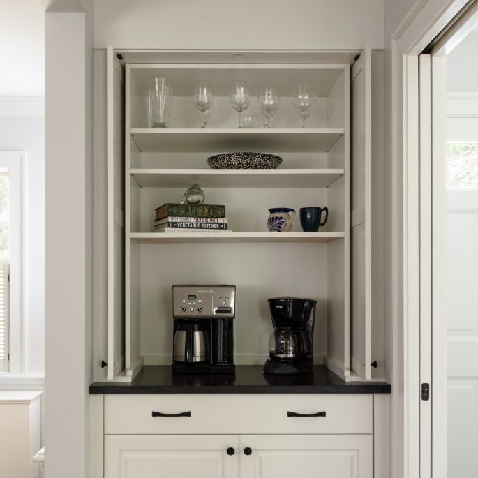
The upper doors are open and slide into a recessed cavity. The new mudroom is to the right of this built-in and has a pocket door. 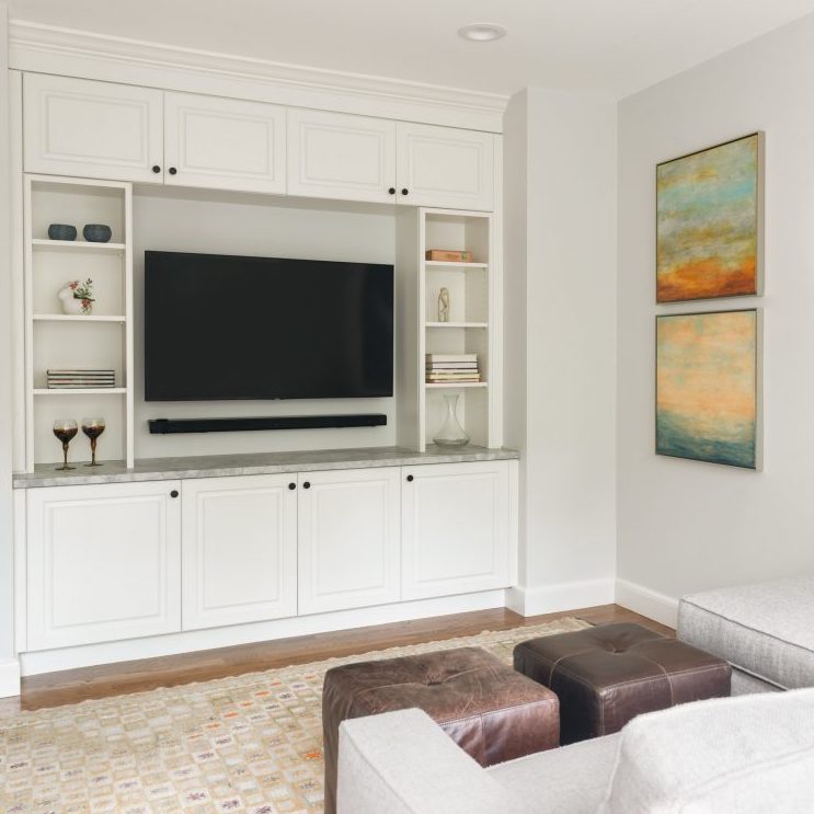
Custom built ins were also added in the family room. We added shallow cabinetry and shelving that frame the television and sound bar.
Finally, a new mudroom with an eye-catching tile floor was added to provide a convenient place for the family to put away coats and bags before entering the home. The original mudroom was a catch-all for coats, artwork and a little bit of everything else. The space was completely reconfigured, adding much-needed storage, a bench for the kids (and adults) to sit and put on their shoes.
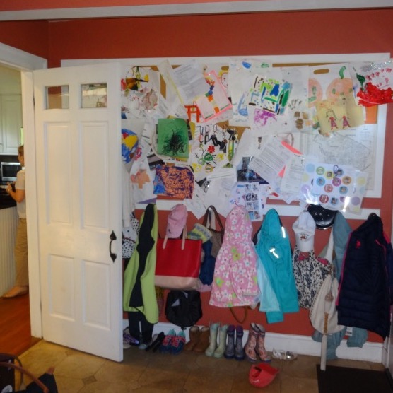
Before – The main entrance to the home lacked storage space. 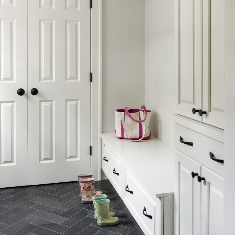
After – The new mudroom is clean and modern with bright white cabinetry, a storage bench, a closet and a contrasting tile floor in a herringbone pattern.

